Showing posts with label Time to Create. Show all posts

Tuesday, 14 March 2017

MOSAIC


Hi! This month, archiscraps has a great challenge involving mosaics.
For my entry I have used a background mosaic stencilled with Distress Oxide ink. First time I've used this new product and I am liking it heaps!


Onto this I've added diecut  mosaic pieces made from a background paper created at a recent class at timetocreate . This has actually been made from paper towels which were coloured with Colour Burst powders. it was amazing how much water these paper towels could hold! 


The photos of what I'm calling footpath art, were taken at a beautiful little picnic / lookout spot  in the Glasshouse Mountains, on Queensland's Sunshine Coast.  There were quite a number of these, each depicting one of the mountains and this snake from one of the local Aboriginal Dreamtime stories.

This is one of the inspirational photos for this month's challenge. Pop on over an check it out.


Cheers for now.  Di


Monday, 21 March 2016

REST!

Hi and welcome! At the moment I'm having heaps of fun experimenting with different mediums to make background papers, some of which I've used to create the layout for this month's ARTastic challenge. The added criteria was to use wood veneer.


The background was part of a paper created in a class held at timetocreate last month. On this we sponged paper soft- colour, through different-sized stencils. This paper soft is a wonderful product which gives fabulous effects. The shapes made were stamped. In the white sections remaining I added some of my tangled patterns with a black sharpie. I also used green, purple, copper and gold sharpies to some sections of the design.
The leaves were made from another piece of background paper I had made last year, using a distress ink smooshed tissue paper glued onto cardstock. This was then stamped with distress and archival inks.
To go with the quirky inspiration art piece, I used a photo of a tawny family from a few years ago. The youngster was definitely AD/HD and stayed awake quite  few hours during the day when it (and parents) should have been sleeping. This was just one of the photos we were able to capture of its antics!

The wood veneer came into play with the speech bubbles, title, butterflies, leaves and owl.
To complete the piece I added some fibres.


Pop on over to artasticchallengeblog to check out what the team has done with this amazing artwork.
Thank you for coming by. Catch you again soon.
Cheers, Di

Monday, 22 June 2015

THE HAZARDS

Hi and welcome. Today, I'm showing a layout which was started over a year ago and finally completed... and a perfect one for this month's theme at Anything But a Card: Out and About.
This layout was started at a workshop at :timetocreate where Julie demonstrated a technique we were to use: spraying white card with metallic paints, swiping over sections with daubers and when dry, putting through an embossing folder.


The board I prepared was cut into different sized strips and put onto black cardstock. I also used an A4 card to tear and distress additional strips of black.. These were placed on the background and some sections were then versamarked through a stencil, and heat embossed... and that's where it was left.

It was left until fairly recently, when iIretrieved it from my UFO pile (getting smaller). I decided to add additional embossing over the black background, some through a stencil and some by just dropping onto the page and carefully heating from some distance, adding more powder as it started to melt. In this way I was able to get flicks of embossing that looked like sea spray on some sections.

 
I added die cut circles put through an embossing folder. inked with silver and also heat embossed with a fine embossing powder, then added the photos.
The photos were taken on our last trip to Tasmania on the beautiful north-east coastline at a charming village, Coles Bay. This bay overlooked the cliff area known as The Hazards.  This is an area we wish to return to and explore further.
There's still time to check out and maybe even enter this month's challenge, so why not pop on over to:anythingbutacard and check out what my teamies have done this  month.
 
Thank you for popping by and leaving some love.
Catch you all again soon.
Cheers, Di

Monday, 22 December 2014

CARNIVALE MASQUE

Hi and welcome.  It's such a busy time of the year so  thank you for dropping by. Anything  But A Card, this month, has been delving into the theme "Celestial", which has meant quite varying things to members of the team.
After a play day at  timetocreate  exploring different ways to change background papers, one paper in particular screamed.. Celestial!!!!  The whole piece, once finished, reminded me of some distant planetary system with moons, satellites, planets. I originally was going to do a mobile featuring such planetary objects, but after a very vivid dream, and one which oddly for me stayed in my mind the day after, I came up with the idea of a festival mask.

Completed mask with photo edited on a night setting to show the glitter.

The background was a glossy black A4 card.  This had been daubed with metallic acrylic paints in copper and bronze.  radiating from these were lines of Viva metallic pens. In between we stamped with silver  and added imprints from the end of our daubers with gold 3D Stamping Paint.


Close-up of mask how it looked at first

To the mask shape cut from this background I added some gold glittered stars, (these have come up silver on this photo), stars cut from gold and copper-coloured mirror board (finished with Kindyglitz bling) and tinsel pipe cleaners bent into star shapes . I added additional silver finishes around the outside of the frame and eye slits ( dabbed on silver ink).

Mask shown in natural light
 I thought that this would be the finish but after further contemplation decided to add another element.. a "Man in the Moon cut from pearlised white card and edged with Kindyglitz. Unfortunately the eye details and edging have not shown up on these photos. The mask is held by hand. This leg has been made from a thin piece of dowel, with tinsel pipe cleaners twisted around it.


mask with the addition of a moon.


Thank you for stopping by. There's still time to get your celestial muses working. We'd love to see your art at anythingbutacard so  why not drop on over and have a look at the amazing pieces done by the rest of the team.

Cheers for now.
Di


Monday, 24 November 2014

FIVE FINISHES FOR NOVEMBER FIVE SUNDAYS AT ABAC

Hi and welcome. This month again has five Sundays, and in keeping with this, Anything But  A Card Challenges is once more featuring the Number Five.


 I have made a small hanging using five different, simple and quite fast techniques to change paper / card into very different looking backgrounds.


The large 5 has been gessoed and sprayed with Dylusions Ink Sprays while the gesso was still wet. When dry I resprayed some sections. This gave an interesting effect with a combination of some white, and different hues of blue.

The smaller 5 has been stamped using a self- made stamp. For this I used scraps left over from mounting stamps onto backing.  These give great effects and you can change them to produce whatever patterns/designs you want whenever you want.


This 5 has again been stamped with a self-made stamp. I took a small block of wood and glued twine / wool on it in a design. They won't last forever, but it's surprising how much stamping you can do with just one application of ink or acrylic paint. If you like you don't have to glue the twine down. You can simply wrap it for an interesting effect.


The smaller 5 has been sprayed with various mists through a stencil The sprays were then fixed with a craft fixative spray.
The larger 5 has been done using a very interesting technique used at timetocreate, on one of our explore days. This simply involves using glossy photos (these can be the oops ones), Viva Modellier Creme ( a luscious, pearly / metallic modelling paste) and some alcohol inks. For this number I cut the photo into segments and glued them onto a backing piece before stencilling with the modelling paste. When dry I pounced over thew whole number with alcohol inks.

All of these techniques are designed to change paper to provide backgrounds for other projects. By using them you produce a piece that is totally unique and individual.
Pop on over to:anythingbutacard to have a look at what others in the team have created. We'd love to see what you come up with.

Thanks for dropping by. Catch you again soon.
Cheers, Di

Saturday, 1 November 2014

YOU MAKE ME SMILE

Hi and welcome. This month, Pixels and Paper is having a joint challenge with Child's Play Challenges, using our photo inspiration and adding extra criteria from Child's Play. This is an opportunity for you to enter both challenges, using the same layout.

For my layout, I  used the hint of blue showing in the inspiration photo as my main colour, the teddy, lace and vintage look. From Child's Play, I added the extra criteria of three patterned papers, gold, bling, an animal, and something at least one year old (photo of dog, plus embellishment of an iris folded teddy, gold Prima flower (also more than a year old), bling around teddy's neck and on the camera embellishment).


Close-up of teddy embellishment. The layers of paper were put onto a cream-coloured background which was then cut out to the teddy shape and stamped with new metallic chalk edgers... liking these!


 The title for my page is an embossing folder sentiment and particularly apt for the photos I have chosen to use.


Papers were heavily distressed and inked. In sections where I tore and then rolled, I inserted snippets of lace or another paper.
The photos were of one of Julie's (Time to Create) little divas that always greets us enthusiastically every time we go to play. Bella and Angel love to be included in everything going on, but Angel, in particular would often jump onto a chair, her paws on the table in front of a work mat with an expectant look on her face, as if to say :"Where's mine?" On this particular day, she wasn't the only one sharing the workspace. Julie launched a new product and we thought it would be fun to include our teddies (because the product was a teddy stamp set). However, Angel was less than impressed with her furry company.... and Bella, to a lesser extent. The stress levels of both little ones rose to the stage where we had to remove the teddies from  the work area. We were certainly smiling and laughing... much, before we could start our class for the day.
Even though both little ladies are less agile now, they certainly still do make us smile.

We'd love to see you come and play with us this month. Pop on over to:Pixels and Paper  to have a look at our inspiration photo and what our team has done and while you're there, also pop over to:
Child's Play Challenges and see what their design team have been up to.

Thanks for popping by and for lovely comments you leave. I always find these encouraging and uplifting.
Cheers for now,
Di.

Thursday, 2 October 2014

FRIENDS


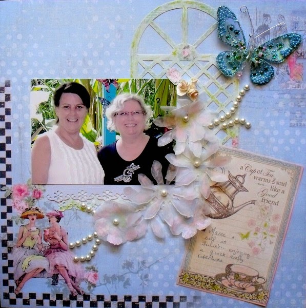
Hi and welcome. The first of October and a new challenge at Pixels and Paper where the inspiration photo could well have you thinking of your favourite cuppa , flowers or pastel colours. Pop on over to:-http://pixelsandpaperchallengeblog.blogspot.com.au/  and have a look at the image as well as what the team has come up with.


 I've left my background paper as it came. This was a fabulous collection from Fabscraps and the images and colours were perfect for this challenge. I've added some punched paper 'lace' strips, using pale blue and pale green, a great sentiment card which has also doubled as a journalling tag, diecut trellis (Fabscraps again), diecut flowers from vellum, pearls and a store-bought butterfly.


All edges were smooshed with one of my new purchases from "Time To Create Handmade Treasures"... the gorgeous MementoLuxe inks. I used Angel Pink and Pear Tart. (green) .. both gorgeous, fresh colours. The vellum was sprayed lightly with Perfect Pearls and finished  with a touch of the the MementoLuxe as well.


The photo is of a good friend and self  having a quick interlude at 'http://timetocreate-handmadetreasure.blogspot.com.au/.
I hope you feel inspired to have a go at our challenge this month.
Cheers, for now.
Di

Designed for Pixels and Paper Challenges

Challenges Entered:
Lasting memories Scrapbook Layout Challenges  Friends) at:
http://kcclayoutchallenges.blogspot.ca/2014/10/lm-211-beautiful-friendship.html

Monday, 1 September 2014

EXPLORE

Hi and welcome again. Today I'm showing you my DT piece for Pixels and Paper. Pop on over to: http://pixelsandpaperchallengeblog.blogspot.com.au/  and have a look at our inspiration photo and how the team has interpreted it.

My layout is depicting a set of photos of my son (aged 8) and myself exploring the rockpools at Flat Rock near Ballina, NSW. This is a great rock platform where all sorts of little hidden treasures can be found. Some of our favourite finds of the day included sea anemones, urchins and starfish.


I've framed the photos  with shaped mats and stamped on these as well as on the photos. I've also added some leftover framing from diecuts previously used. These are perfect for highlighting specific parts of a photo, making it look like a slide.


The title was diecut and then painted with a thick texture paste. This was very grainy and gave the appearance of sand.  Some 'crab' trails were added with a gold Kindyglitz (a glitter glue).
Diecut sea creatures  were heat embossed with Opals embossing enamels.  The chipboard pieces were purchased from Julie at  http://timetocreatehandmadetreasure.blogspot.com.au/                       .


The sea anemones were fringed and quilled from textured pearlised  and cobweb papers.
To complete the whole piece is a lovely quote... so true!
Thank you for coming by. Catch you again soon.
Cheers, Di

Saturday, 19 October 2013

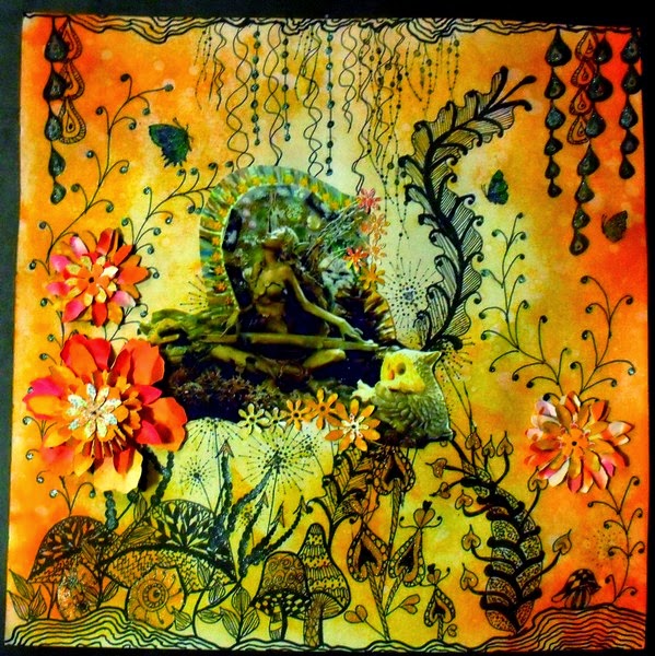
ENCHANTED GLADE (with Zentangles)

Hi and welcome. It seems like ages since my last post, but I am still having a bit of a nerve problem in my hand, so some activities are limited. However, I have had a couple of fabulous playdays/ classes with friend Julie at:http://timetocreate-handmadetreasure.blogspot.com.au/. It was great to get back together with friends to create some amazing pieces.
This layout is for the current challenge at ABAC, where the criteria is for orange or orange and  black.  Pop on over to http://anythingbutacard.blogspot.ca/    to see what the DT members have done for this.
I've gone for a fantasy theme. The background was doodled first, creating the glade. Some newly purchased Chocolate Baroque stamps (lovin' these!) were used for some extra detail.


The whole background was then smooshed with Distress Inks (Wild Honey, Dried Marigold, Spiced Marmalade and Ripe Persimmon). After attaching the photo and adding die cut flowers (again from smooshed and inked paper) I highlighted some sections with 3D Stamping Paint (blue and copper) to give a bit of sheen.


            Some close-ups of the layout... trying to show the effect of added 3D paint, and stamping.

I have used the fairy composition in the photo before, in a different setting and colour. She is a favourite of mine and may appear again sometime in the future, with some changes. I rather enjoy making different scenarios for her.
Thank you for visiting. It's always a pleasure to read comments that are left.
Cheers, Di

Thursday, 20 June 2013

Recycling we shall go

Hi and welcome! I've had quite a busy week, including participating in a delightful class at Julie's at   http://timetocreate-handmadetreasure.blogspot.com.au/    on Sunday, where a group of us completed tribute layouts specifically designed to fit into a shadow box, because of the number of layers involved. I now only have to finish the frame and my memory piece will be ready for display.
Over at ARTastic, http://artasticchallengeblog.blogspot.com.au/  there is a challenge, running until the end of the month, which involves recycling materials. The only things I haven't recycled are the brads, washi tape, inks and paints.
I started with a base from the back of a Tim Holtz cardstock pack.


On this I've added some strips of washi tape, before layering with corrugated cardboard from packaging. For some additional texture I've added some scraps of crumpled and misted glassine paper, which had been used for die-cut flowers on a previous layout. The framing on the photo are again left-over scraps.  Flowers were die cut from glossy ice-block packaging (alcohol inked), old book binding material (alcohol inked then painted with 3D stamping paint) and water colour paper. For the colours on this, I pressed flowers through a cuttlebug. This gave a gorgeous, soft blending of colours. The flourishes were left overs, and the fibre came from  a  bouquet of flowers. The stamping on the background were also done with recycled material; polystyrene packaging.


The photo is of  a giant Bird- of - Paradise (Strelitzia nicolai) which is growing in my garden..... much bigger than I expected, but providing an 'umbrella' for my gorgeous tawny frogmouth visitors, especially in wet or very hot conditions.
 
Thank you for visiting, and for your lovely comments. Cheers, Di


Friday, 7 June 2013

Rose Tag

Hi and welcome! Firstly thank you to the design team for choosing me as a feature artist for Challenge 19. This was a lovely and unexpected surprise.
Challenge 20 at ABAC; http://anythingbutacard.blogspot.ca/  has been exactly that:- a challenge in where to start!! The dusting off of old supplies has certainly been a good incentive to look in some drawers that haven't been foraged into for quite some time and I did find quite a few items (a lot with the 'what was I thinking of'! factor. Yes, there were a large number of stickers (which no longer self-adhere), some roses (made from very thin sheets of rubber, which had been an "I'll use those" purchase) AND!!!! a Tim Holtz mini mask which I'd forgotten I'd bought and until now, never used.
The tag I made started off as a piece of card stock with a thin layer of gesso applied to it. While wet, it was sprayed with Glimmer Mists (Walnut Gold, Coffee Shop and Suede). These were smooched together using a plastic bag (thanks Julie). Then it was sprinkled with perfect Pearls powder (Perfect Gold) and left to dry.
The mini mask was used as a stencil, and the flourish was made using 3D Stamping Paint in Moss green.


The stickers, roses and crushed velvet ribbon were added. In my stash I also found a chipboard word 'DREAM' which I broke up to add to the tag. A net and pearl bead dragonfly and some wool have completed the tag.


Thank you for stopping by and leaving comments.These make my day. Cheers, Di

Thursday, 14 March 2013

Irish Wishes

Hi! and welcome. Firstly, a huge THANK YOU to the DT members for selecting my "Luck" layout, as one of the featured artist pieces for Challenge 13.
I had a great day  at Julie's ( http://timetocreate-handmadetreasure.blogspot.com.au/  ) on Saturday playing in her Explore class, trying out some different techniques with alcohol inks, Viva: Glitter Paint, Glass Effect Gel and 3D Stamping Paint. This play led my challenge piece for ABAC (http://anythingbutacard.blogspot.ca/) to go in a slightly different direction by incorporating some of the play techniques. So this is my take on Challenge 14: St Patrick's Day or Green Theme. My project is Irish inspired (Irish blessings and wishes), and green  two ways (the predominant colour and using upcycled acetate from packaging).
I've selected a number of Irish blessings and wishes and used these for a shamrock-shaped mini-book, the pages of which are also showing some different finishing techniques.


There will be quite a few photos to show these finishes. A common one for the background for  the wishes, was smooshing with Distress Inks: Peeled Paint, Forest Moss and Mowed Green. Some  were also sprinkled with water for that lovely mottled effect. These were then completed with a faux stitch finish using either Liquid Pearls: Peacock, or an ultra-fine Sharpie, green. The wishes backgrounds were then adhered to a green  background, after the backgrounds had some finishing touches.
The cover for the mini-book is made from up-cycled acetate.The leaves were traced in Viva Gloss Effect Gel: Contour Copper. The reverse side of the design was painted with Ranger Vintaj Patina: Jade and Moss. The whole of the reverse side was then smooched with Alcohol Inks ( Willow, Citrus, Oregano and Sailboat Blue).


The Title Page was done on white  cardstock, and given a couple of different treatments. First, I painted it with Distress Stains: peeled Paint, Forest Moss and a touch of Mowed Lawn. I sprinkled it with water and while still slightly damp, smooched over with Picket Fence. then in an 'Aha!" moment, decided to smooch over the lot with Distress Inks in Peeled Paint and Forest Moss and re- sprinkling with flicks of water.... great algae effect! Definitely a background method I will use again. When dry, I gave the page a quick edge of Kindyglitz: Crysalina and added the title. These were bought silver glitter cardstock letters, but to give them more of a moss effect, were coloured,  with alcohol inks: Willow and Oregano.


The green background cardstock for this page was covered with a layer of washi tape, which was also roughly pleated to give a ruffle effect edge.


Page 2 was finished with Glitter paint- green.


This page was stamped with Versamark and finished with Perfect Pearls: Forever Green. Just a fine shimmer, hard to capture in the photo.


With this page I had another of those 'Aha!" moments. I've always used a free-form style for applying tacky glue for foiling... BUT!! how would it go, if I stamped on the glue. It worked! I did use an inexpensive clear stamp (just in case). When the  glue 'tacked' off I foiled the design in silver.


Page 5 was put  through an embossing folder and smooched over with Brilliance Pearlescent ink:Olive. A few finishing touches were added with Liquid Pearls:Peacock.


This page has my play with the Viva 3D Stamping Paint; Metallic Moosegrun.  Again I used a clear stamp to see how it would go, because this medium dries so quickly and has to be scrubbed immediately after use. I loved the effect this medium has and will be using it more.


For the final page I've dropped on Opals Embossing Enamels: Furneaux- a deep  green,  in patches (one section at a time) heated them and while still molten, stamped on a leaf pattern (used stazOn for  this). This gave a fabulous texture which hasn't shown up on the photo. The only thing you have to remember with this technique is to leave the stamp in place, until it releases slightly (about 30 seconds),  before removing it.


The book was put together using a binder ring and some ribbons and braid to complete it.
I hope you have enjoyed your visit. Thank you for coming and for your inspiring comments.
Cheers, Di

Monday, 28 January 2013

String Prints

Hi and welcome. Today I'm showing a very old method of printing, which I first used at Teacher's College, and then again with a number of students in classes during the years I was teaching. This string block method is also my entry for ABAC Challenge 11, where you were to feature anything that could be theoretically tied. Pop on over to http://anythingbutacard.blogspot.ca to see the DT makes and other great entries.
Mark-making, as my friend Julie at http://timetocreate-handmadetreasure.blogspot.com.au often advocates, is a fantastic way to make a unique paper, and with printing marrying up with other techniques you truly will have something that cannot be replicated, even by yourself. It allows for experimentation using different mediums and is a great way to alter those 'unloved' papers that often languish around in our stash.
String block printing is a simple process. All you need are: blocks of wood (I've used pine off-cuts which have been lightly sanded to remove sharp edges), PVA glue and string (or any other fibre.... I've used some wools in different textures and thicknesses as well as string).
First, PVA is generously applied to the face of the wood, fibre put down in a pattern, or as in the case of one of the wools, just stretched out (it featured netting strips, bobbles and wisps of wool) and everything left to dry.


Wood blocks showing string and wool designs ready for printing and below, some of the prints using the above blocks.


Then the fun of printing. I experimented with Distress Ink, but found this needed frequent application to get a repetitive print. In the end I went with Distress Stains and had some great results. The best came from the wool. These, with just a small application of stain gave fantastic paper coverage. I ended up with two, 12x12 backgrounds and one A4, from the one application..... a little really did go a long way. I've made 7 print blocks so far but will make more, varying the sizes so I can vary the fibres being used. ( It's also a great way to recycle bits of string and other fibrous packaging, and bits of ribbon and lace that may be too small to use elsewhere).

This post leaves me thinking of everyone effected by yet another weekend of natural disasters in Australia, with the east coast of Qld and NSW being hit by torrential rain, cyclonic winds and severe flooding. Where I am, is safe from flooding, but we have certainly been feeling the force of the wind, the worst I have experienced in my 30 years here. Wherever you are, take care and be safe.

Thank you for stopping by. I love knowing if you have visited. Cheers, Di
Saturday, 22 December 2012

Really Mum!

Hi! Today I've had fun with a layout which I'm entering in the ARTastic Challenge using bold background paper or paint at http://artasticchallengeblog.blogspot.com.au . The background paper for this was covered in various textured squares and rectangles  in different hues of blue. To this I've daubed on thick white and dark grey acrylic paint, and added a notepad teddy paper which was given a wash of acrylic paint as well.


Angel's and Bella's thoughts about teddies!

The gorgeous bundles, Angel and Bella belong to friend and art guru, Julie, at http://timetocreate-handmadetreasure.blogspot.com.au/. They form a  fantastic welcome committee for all visitors. These bundles of joy are cute, cuddly, loving, inquisitive but can be a little wilful and obsessive at times. The day these photos were taken was during a workshop Julie held, using Docraft Wellington Bear stamps and to add to the 'beary' fine day, there were some teddy bear guests. Wellington would have wondered what all the commotion was about! The teddies became the focus of attention for the girls and they were determined to find out about these interlopers.... so it was up onto a chair and then the table for a closer inspection. Hence, the mournful and plaintive expressions on their faces. In the end, the bears were put away so the girls could regain their sensibilities and with much hilarity, our workshop could continue.
The layout has been completed with faux stitching on the thickers for the title, footprint brads and a stamped Wellington, coloured  with Lyra Aquarells.
I think puppy power made the day!
Thank you for visiting. Merry Christmas and a Happy New Year.
Cheers, Di