Showing posts with label Vintaj Patina. Show all posts

Monday, 22 September 2014

STEAMPUNK TAG

Hi and welcome. This month at ABAC, we've been exploring the very versatile steampunk theme. As it was recently Father's Day here in Australia, I decided to do a male orientated tag.


Firstly I cut a tag from cardstock which was originally an experimentation piece. I then stencilled over it using silver Delicata ink (shown up as white, below).

 
After this was dry, I stamped in versamark and added black embossing powder to some of the edges.


 Cream cardstock was put through an embossing folder and smooshed with Distress Inks (Black Soot, Weathered Wood, Faded Jeans and Barn Door). This was mounted onto metallic black card and attached to the tag base.
The stamped playing card was smooshed with Barn Door. Cogs were die cut (Tim Holtz) from crumpled layers of aluminium foil and attached .


These looked too 'new' so I tipped on splashes of alcohol ink and vintaj patina then scratched off some of the colour in parts. Some black stazon was also added on some of the cogs.
A couple of metal embellishments, also treated the same way, completed the tag.
Thank you for stopping by. There's still time to enter  our steampunk challenge, so why not pop over to: http://anythingbutacard.blogspot.ca/ and check out what the rest of the team has done this STEAMPUNKTEMBER!!!

Cheers for now, Di.

Sunday, 15 June 2014

HEART AND HOME

Hi and welcome. It's a lovely, sunny winter's day here in our little patch, with just enough crispness for some extra layers.
This month at the ARTastic challenge has been distressing!! and my DT piece for this has certainly been distressed.


My piece started off as inside packaging from a box. The corrugated cardboard was already framed and recessed, making the perfect surface to work the distressing on.
The frame was torn to various depths to show underneath layers. Some bits were rolled and others left partially raised to give an old wood/peeling paint effect.


The whole surface was sprayed with Baseboard and Chalkboard mists with additional layers of colours from Distress Stains and Inks. Gesso was used for the stencilled leaves while the undersurface was still damp.. love the effect that this gives!


The photo I used was from an oil painting given to me by my mum. This was by an artist / teacher, Ken Harris. Mum took up painting classes with him when she was 70 and really enjoyed her new hobby until ill health prevented her from continuing when in her 80's.


This was mounted on a gelli plate print done with acrylic paints. This was still too bright for the effect I wanted, so it was also smooshed with Distress Inks.


Edges were torn, rolled and inked, with pieces of old manuscript music tucked into some of the gaps,
before attaching.
The original background I'd prepared didn't look right, so I used a piece of brown cardstock, dampened it with water and scrunched it up. When dry, it was inked and edges were torn for a more rustic look


More torn and inked music manuscript was placed around the frame


To this I added acetate leaves coloured with Vintaj and glass effect gels, die cut leaves, heavily scrunched and then shaped, and real gumnuts.
I really enjoyed this challenge and if you are tempted to join in, have a peep at our inspirational guide artwork at   http://artasticchallengeblog.blogspot.com.au/  and while you're there have a look at the fabulous creations done by the rest of the team.

Thankyou for stopping by. Catch you soon.
Cheers, Di                                                                                          .

Sunday, 16 March 2014

BIRDS OF A FEATHER?!!!!

Hi and welcome. The inspiration for this month's challenge at ARTastic is to include texture.... a great source of inspiration for me, particularly lately, as I have been exploring and playing with  inky, painty and gooey things and what happens when they are used together!


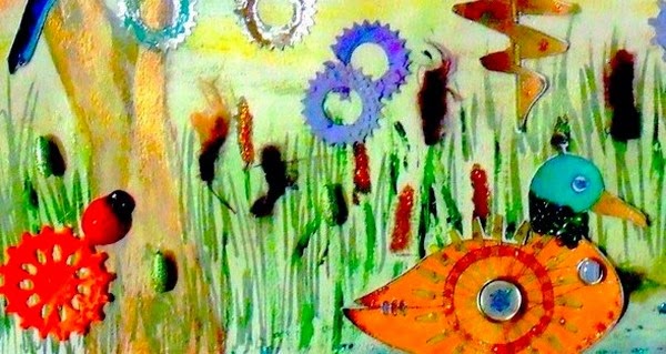
My piece for this ended up as a painted scene on a heavy watercolour A3 paper. Acrylics and texture paint were used to create the background scene and some of the features (tree and dove cote). 3D stamping paint was added in other areas (pond, parts of birds, and cogs). The birds were stamped with my new Chocolate Baroque Steampunk set...lovin' this!


                                          Close up of owl and doves!!! and dove cote


                                             Close up of parrots showing beading and cogs


                                                    Duck and bulrushes, cog flowers.
                                
They were coloured using metallic gel pens,  Lumiarte acrylic pigments and Silks acrylic glazes. To give more texture to the wings, I glued on micro- beads.
Cogs were made from aluminium flashing, embossed and painted with Vintaj patinas. Wool ans single beads were used for the bulrushes.


A bit quirky, but a lot of fun in the making.
There's still time to join in our challenge at ARTastic. Pop on over to:http://artasticchallengeblog.blogspot.com.au/  to see what our inspiration picture was and the fabulous artworks by the rest of the team. We'd love to see your art here.

Thank you for stopping by. Catch you again soon.
Cheers, Di.

Tuesday, 16 July 2013

Steampunk Tag

Hi and welcome!
I've had my first go at producing something in the Steampunk mode... at least I hope it is! A lovely crafty friend, Judi, lent me her Chocolate Baroque set, with a gorgeous butterfly. It is this that I chose to use as part of a tag for the current ABAC Challenge 23 'Steampunk'. See what the design team has come up with at: http://anythingbutacard.blogspot.ca/
I started by covering a tag with self-adhesive aluminium plumbers flashing; embossed in 2 different folders, just to give a couple of different textures on the background. This was then smooshed with alcohol inks.

 
I thought that this didn't look quite old enough, so I smeared on some 3D stamping paint and when dry, lightly sanded back some of the raised sections.


The effect can't fully be seen here, but this did tone the colours back quite well.
The butterfly was stamped onto silver mirror board and coloured with permanent markers before being adorned with brass brads and bling.


Cogs were also die cut from the same card and inked with alcohol inks and Vintaj Patinas.


Roses were quilled from folded strips of aluminium kitchen foil. This took a little experimentation to find the right number of times to fold the strips so that they stayed intact. Alcohol inks were swiped across the petals, and Patina carefully tipped on and smoothed out with a small brush.
I completed the tag with a strip of lace from my stash.


This was an interesting challenge and it certainly took me in a new direction of experimentation.
 
What I used:
Alcohol Inks: Latte, Ginger, Espresso, Mushroom and Metallic Copper.
Vintaj Patina: Verdigis, Rust.
3D Stamping Paint: Black
 
Thank you for visiting and for your lovely comments.
Cheers, Di


Saturday, 6 July 2013

A Messy Journey

Hi! Just getting this in before the deadline at:http://anythingbutacard.blogspot.ca/ . This challenge (Number 22) certainly had me getting messy, sticky and inky! - some very interesting effects on my fingers!
I started by covering a piece of patterned card with Gel Medium. On this were placed punched flowers and other shapes, another layer of gel and a layer of tissue paper.


This was covered with gesso, spritzed with Dylusions Sprays and lightened with White Linen. When dry, a section was stencilled using 3D Stamping Paint. At this stage, I decided that I didn't really like the overall effect, so I added some more gesso over all of it (a thin layer) and when dry, smooched on Distress Inks, leaving a more subtle effect.


Various other pieces were prepared. This used the natural dyes from flowers and foliage: freshly picked, put between light card and rolled through the Cuttlebug:- very effective, but it can be rather messy because some plants are juicier than others. The rollers have to be cleaned as soon as you finish.


The stencil piece is a second generation stencilling. The original was quite bright (have kept it for something else). When gessoed it had been lightly spritzed with Dylusions. For the above, I flipped the stencil over and added just a little more gesso, drawing in any colour still left. I liked the effect it had of additional foliage in the background.


This is a piece of microfiche. The same stencil has been used, this time with the 3D Stamping paint.


The chipboard was smooshed with Distress Inks and then had Vintaj Patina brushed on to give more of an aged look.


The piece has a slightly textured finish and even though on card, still has a slightly metallic appearance.
 
 
Some stamping around the edges and a stamped film strip, have completed the front cover.


This cover and panelling are now the first part of "My Messy Journey" .... an art journal to hold information and samples of the messy experiments. Hopefully many pages will be added.
 
What I Used:
Distress Stains: Forest Moss, Peeled Paint, Shabby Shutters, Picket Fence (chipboard)
Vintaj Patina: Moss, Rust (chipboard)
3D Stamping Paint: turquoise, moss green, silver, blue ( large background, microfiche)
Dylusion Sprays: London Blue, Cut Grass, Lemon Zest, White linen ( background, stencilling)
Distress Inks: Mowed lawn, Forest Moss (background)
Archival Ink: Olive
Impasto Gel medium, Gesso
 
Thank you for visiting and for your encouraging comments.
Cheers, Di

Thursday, 14 March 2013

Irish Wishes

Hi! and welcome. Firstly, a huge THANK YOU to the DT members for selecting my "Luck" layout, as one of the featured artist pieces for Challenge 13.
I had a great day  at Julie's ( http://timetocreate-handmadetreasure.blogspot.com.au/  ) on Saturday playing in her Explore class, trying out some different techniques with alcohol inks, Viva: Glitter Paint, Glass Effect Gel and 3D Stamping Paint. This play led my challenge piece for ABAC (http://anythingbutacard.blogspot.ca/) to go in a slightly different direction by incorporating some of the play techniques. So this is my take on Challenge 14: St Patrick's Day or Green Theme. My project is Irish inspired (Irish blessings and wishes), and green  two ways (the predominant colour and using upcycled acetate from packaging).
I've selected a number of Irish blessings and wishes and used these for a shamrock-shaped mini-book, the pages of which are also showing some different finishing techniques.


There will be quite a few photos to show these finishes. A common one for the background for  the wishes, was smooshing with Distress Inks: Peeled Paint, Forest Moss and Mowed Green. Some  were also sprinkled with water for that lovely mottled effect. These were then completed with a faux stitch finish using either Liquid Pearls: Peacock, or an ultra-fine Sharpie, green. The wishes backgrounds were then adhered to a green  background, after the backgrounds had some finishing touches.
The cover for the mini-book is made from up-cycled acetate.The leaves were traced in Viva Gloss Effect Gel: Contour Copper. The reverse side of the design was painted with Ranger Vintaj Patina: Jade and Moss. The whole of the reverse side was then smooched with Alcohol Inks ( Willow, Citrus, Oregano and Sailboat Blue).


The Title Page was done on white  cardstock, and given a couple of different treatments. First, I painted it with Distress Stains: peeled Paint, Forest Moss and a touch of Mowed Lawn. I sprinkled it with water and while still slightly damp, smooched over with Picket Fence. then in an 'Aha!" moment, decided to smooch over the lot with Distress Inks in Peeled Paint and Forest Moss and re- sprinkling with flicks of water.... great algae effect! Definitely a background method I will use again. When dry, I gave the page a quick edge of Kindyglitz: Crysalina and added the title. These were bought silver glitter cardstock letters, but to give them more of a moss effect, were coloured,  with alcohol inks: Willow and Oregano.


The green background cardstock for this page was covered with a layer of washi tape, which was also roughly pleated to give a ruffle effect edge.


Page 2 was finished with Glitter paint- green.


This page was stamped with Versamark and finished with Perfect Pearls: Forever Green. Just a fine shimmer, hard to capture in the photo.


With this page I had another of those 'Aha!" moments. I've always used a free-form style for applying tacky glue for foiling... BUT!! how would it go, if I stamped on the glue. It worked! I did use an inexpensive clear stamp (just in case). When the  glue 'tacked' off I foiled the design in silver.


Page 5 was put  through an embossing folder and smooched over with Brilliance Pearlescent ink:Olive. A few finishing touches were added with Liquid Pearls:Peacock.


This page has my play with the Viva 3D Stamping Paint; Metallic Moosegrun.  Again I used a clear stamp to see how it would go, because this medium dries so quickly and has to be scrubbed immediately after use. I loved the effect this medium has and will be using it more.


For the final page I've dropped on Opals Embossing Enamels: Furneaux- a deep  green,  in patches (one section at a time) heated them and while still molten, stamped on a leaf pattern (used stazOn for  this). This gave a fabulous texture which hasn't shown up on the photo. The only thing you have to remember with this technique is to leave the stamp in place, until it releases slightly (about 30 seconds),  before removing it.


The book was put together using a binder ring and some ribbons and braid to complete it.
I hope you have enjoyed your visit. Thank you for coming and for your inspiring comments.
Cheers, Di