Hi and welcome. Today I'm sharing a canvas featuring some of the places I love to visit in my local area as well as an artwork by an indigenous Australian artist, Sally Morgan, as my DT piece for Anything But A Card. Our theme this month has been "Inspired By the Masters".
This artwork by Sally Morgan is a screen print "Aboriginal Land" from 1995. This depicts images of six different Australian landscapes including desert, rivers, mountains and trees. The whole piece has been encircled by a rainbow serpent to give strength and unity to the print. It is also a creation spirit in Aboriginal Australia.
I chose a 50 x 35cm canvas so that I could work a number of photos on a larger area. The background was sprayed with Dylusions Inks and Lindy Stamp Gang sprays. A border of leaves was stencilled on with Viva Modelling Creams and Ferro combinations.
I also stencilled on a water effect with the same products. The photos I used all have some significance with each other, as well as some Aboriginal significance.
The top photo is an aerial view of Mt Warning, named so by Captain Cook and known as Wollumbin by the local Aboriginals. This peak and the rim of mountains around it are the remains of a huge shield volcano which covered this area. With the erosion over the millennium, the beautiful Tweed Valley, Richmond Valley and the Border ranges were formed.
The remaining photos are of the Nimbin Rocks, Whian Whian Falls (taken one very misty morning), rapids at a creek near Protester's Falls, and overflow from Rocky Creek Dam, after a period of flooding rain.
Rain that falls in the Mt Warning and Border Ranges catchment area impact these creeks and dams, hence the water connection on the canvas.
Many of the towns and villages, particularly in the Tweed have Aboriginal names, including the home town of my childhood and teenage years, Murwillumbah.
They are all a part of rainforest areas and that is why I have chosen to use the leaves to connect them. My bright colours, inspired by Sally Morgan, have been used in the flowers that I've made. These represent lillypilly flowers which are a typical rainforest tree. These were painted onto card using modelling cream and then streaks and dots of pearl pens. Additional leaves were stamped onto mop-up card and cut out.
Pop on over to: anythingbutacard and check out what masters the rest of the team has chosen and how they've been inspired.
Catch you again soon.
Cheers, Di
Showing posts with label Dylusion Sprays. Show all posts
Monday, 18 May 2015
Sunday, 18 January 2015
ART JOURNAL FOR 2015
Hi again. This month at Anything But A Card, we are looking at new beginnings. This can be interpreted in many ways and I have chosen to start a new art journal for the year, in the hope that I can be more organised with my experimentation and discoveries.
I started with a plain A$ 2-ringed folder / binder. I covered this with an application of gesso then sprayed and spritzed with various sprays and inks through a stencil as well as freely.
When dry I decided to use a new stencil (large flower) using Viva modellier creme to create the flowers. These were then either outlined with glass effect gel (black) or dotted with viva decor pens in copper or sparkle.
Black stamping was also used....another new stamp from Visible Image.
Added also, were quotes stamped onto tissue paper and then applied to the folder.
Pop on over to anythingbutacard and check out what the rest of the team has come up with for this month's inspiration.
Cheers, Di
Sunday, 1 June 2014
RAINBOW CONNECTION
Hi and welcome. The first of June means another new challenge at Pixels and Paper and another great photo for your inspiration. As we, in the Southern Hemisphere head into winter and others in the North head into summer, this photo certainly reflects those not so sunshiny days.
When I first saw this the vibrant pop of red from the bench seat was the first thing that caught my eyes. then I looked for the more subtle images hidden by the misty rain.
The photograph I have used on my layout was taken by my son at a recent short get away to Caloundra on Queensland's Sunshine Coast (north of Brisbane). It had rained during the night and early morning, but we decided to risk the possibility of another shower and went for a pre-breakfast walk along the boardwalk. The skies were still very murky and then it started to rain. We found some shelter and stayed there until the shower passed and as luck had it, out came the most glorious double rainbow which reflected in the water of the bay.
The colours of the rainbow then became an integral part of the layout. The background colours reflected those in the sky and in our inspirational photo. The metallic silver cardstock has been embossed and then lightly inked with archivals. The same cardstock was used for the large raindrops which were stamped and cut out, as well as for the drawn title, coloured using Peel-off markers.
Added to the scene is a diecut figure (looking at the scene), diecut flagstone footpath and a bench seat .
To finish off I added small drips of Kindyglitz to give the sparkle of raindrops in the sunlight.
Pop on over to:http://pixelsandpaperchallengeblog.blogspot.com.au/ to see the fantastic work by the rest of the team.
Thank you for visiting. I love reading your positive comments and look forward to stopping by your blogs to see what you have been up to.
Cheers, Di
![]() |
| Pixels and paper inspirational photo for June |
When I first saw this the vibrant pop of red from the bench seat was the first thing that caught my eyes. then I looked for the more subtle images hidden by the misty rain.
The photograph I have used on my layout was taken by my son at a recent short get away to Caloundra on Queensland's Sunshine Coast (north of Brisbane). It had rained during the night and early morning, but we decided to risk the possibility of another shower and went for a pre-breakfast walk along the boardwalk. The skies were still very murky and then it started to rain. We found some shelter and stayed there until the shower passed and as luck had it, out came the most glorious double rainbow which reflected in the water of the bay.
The colours of the rainbow then became an integral part of the layout. The background colours reflected those in the sky and in our inspirational photo. The metallic silver cardstock has been embossed and then lightly inked with archivals. The same cardstock was used for the large raindrops which were stamped and cut out, as well as for the drawn title, coloured using Peel-off markers.
![]() |
| Close up showing rainbow- coloured raindrops and title |
Added to the scene is a diecut figure (looking at the scene), diecut flagstone footpath and a bench seat .
![]() |
| Close up showing diecuts and pice of cardstock embossed with ripples. This was a piece of an experimental background, sprayed with Dylusions Inks and Perfect Pearls Mists. |
To finish off I added small drips of Kindyglitz to give the sparkle of raindrops in the sunlight.
Pop on over to:http://pixelsandpaperchallengeblog.blogspot.com.au/ to see the fantastic work by the rest of the team.
Thank you for visiting. I love reading your positive comments and look forward to stopping by your blogs to see what you have been up to.
Cheers, Di
Thursday, 21 November 2013
Autumn Tag
Hi and welcome. Tags are becoming one of my favourite forms of mini-art. I've a long way to go, but am enjoying the experimentation process.
This tag is for the current challenge at Anything But A Card: Fall into Fall. Pop on over to: http://anythingbutacard.blogspot.ca/ to see what the DT has been up to.
I used a Kraft tag for the base and smooshed it with gold metallic alcohol ink, as well as the colours previously used and left on the applicator. I loved the effect this made and it's one I'll use again. I was surprised to see how well a non-glossy surface took alcohol ink. the edges were swiped with Inca gold.
For the next layer I added a smaller tag made from a metallic gold vellum. The edges of this were swiped with 3D Stamping paint. The next tag was made from acetate packaging, alcohol inked and then put through an embossing folder. On the front I rubbed on some Inca gold and 3d stamping paint. The leaves were die cut using the Tim Holtz Tattered Leaves die. These were also cut from acetate packaging and glossy cardboard packaging. The surfaces were treated the same way as the base with the addition of metallic gold alcohol ink.
Some images from Graphic 45 "Place in Time" collection and a snippet of an autumn poem from an old poetry book (smooshed with Distress Ink) completed the tag. It was finished with a bow made from seam binding, spritzed and sprayed with Dylusions Inks, Glimmer mists and water.

Thank you for visiting and for your lovely comments.
Cheers, Di.
This tag is for the current challenge at Anything But A Card: Fall into Fall. Pop on over to: http://anythingbutacard.blogspot.ca/ to see what the DT has been up to.
I used a Kraft tag for the base and smooshed it with gold metallic alcohol ink, as well as the colours previously used and left on the applicator. I loved the effect this made and it's one I'll use again. I was surprised to see how well a non-glossy surface took alcohol ink. the edges were swiped with Inca gold.
For the next layer I added a smaller tag made from a metallic gold vellum. The edges of this were swiped with 3D Stamping paint. The next tag was made from acetate packaging, alcohol inked and then put through an embossing folder. On the front I rubbed on some Inca gold and 3d stamping paint. The leaves were die cut using the Tim Holtz Tattered Leaves die. These were also cut from acetate packaging and glossy cardboard packaging. The surfaces were treated the same way as the base with the addition of metallic gold alcohol ink.

Thank you for visiting and for your lovely comments.
Cheers, Di.
Saturday, 19 October 2013
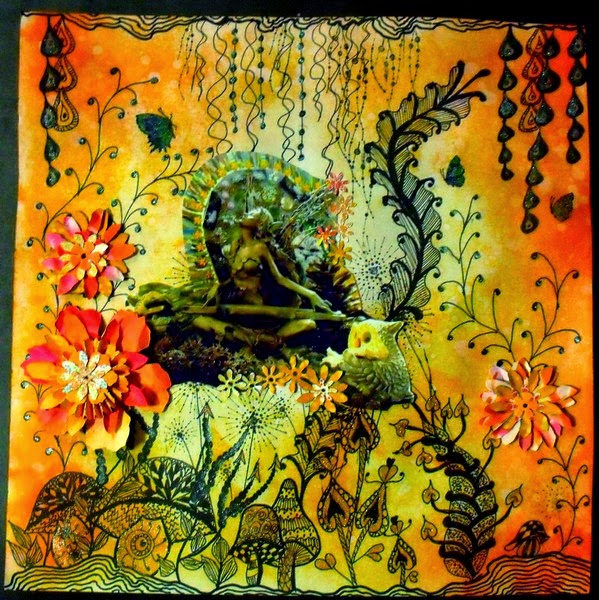
ENCHANTED GLADE (with Zentangles)
Hi and welcome. It seems like ages since my last post, but I am still having a bit of a nerve problem in my hand, so some activities are limited. However, I have had a couple of fabulous playdays/ classes with friend Julie at:http://timetocreate-handmadetreasure.blogspot.com.au/. It was great to get back together with friends to create some amazing pieces.
This layout is for the current challenge at ABAC, where the criteria is for orange or orange and black. Pop on over to http://anythingbutacard.blogspot.ca/ to see what the DT members have done for this.
I've gone for a fantasy theme. The background was doodled first, creating the glade. Some newly purchased Chocolate Baroque stamps (lovin' these!) were used for some extra detail.
The whole background was then smooshed with Distress Inks (Wild Honey, Dried Marigold, Spiced Marmalade and Ripe Persimmon). After attaching the photo and adding die cut flowers (again from smooshed and inked paper) I highlighted some sections with 3D Stamping Paint (blue and copper) to give a bit of sheen.
Some close-ups of the layout... trying to show the effect of added 3D paint, and stamping.
I have used the fairy composition in the photo before, in a different setting and colour. She is a favourite of mine and may appear again sometime in the future, with some changes. I rather enjoy making different scenarios for her.
Thank you for visiting. It's always a pleasure to read comments that are left.
Cheers, Di
Saturday, 7 September 2013
Finally, an art journal!
Hi and welcome. Just a very quick post, sharing the beginnings of an art journal... something I've had on the back burner to do but never seemed to find the time to actually start. Thanks to Julie's mini-challenge this week at http://anythingbutacard.blogspot.ca/ I've actually made a start!
It's going to be a working journal of my experiments with paints, inks, sprays and other mediums and how these react on various papers and background surfaces.
Stage 1 of front cover... gesso, Dylusion sprays and stencilling. This ended up as a surprise. After gessoing and spraying over the stencils, I didn't like the result so gessoed over the whole lot. I used a different stencil, sprayed and then spritzed the rest of the area with Dylusions and Perfect Pearls Mist and let it run. As it dried, SURPRISE!! the top layer started sinking and some of the bottom layer started appearing... INTERESTING!!!! LOVE IT!!!!!
The writing isn't perfect, neither are the samples.. it's how they have turned out. What I'm planning to add at some stage, will be samples or photos, of how and were some of these techniques have been used.
Thank you for visiting and for your continued positive comments.
Catch you again soon.
Cheers, Di
Subscribe to:
Posts (Atom)