Hi and welcome.
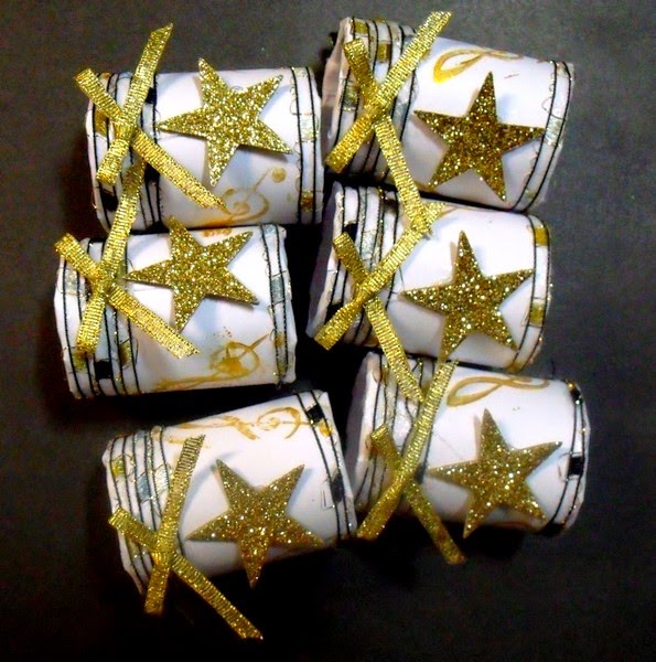
Today I'm sharing a quick upcycled project, one that lends itself to many different interpretations and themes... napkin or serviette rings.
For this project I've used the inner roll from aluminium foil, cut into lengths. These were covered with stamped laser colour paper (a thin card). The ends were glued and wrapped with metallic yarn. I added gold bows (shop bought) and small wooden stars coated with gold glitter flakes. A simple makeover, relatively fast to do... and it used up some bits and pieces I've had for some time.
There's still time to enter our challenge at Anything But A card this month... anything goes as long as it isn't a card. We'd love to see what you could do for this. Pop on over to:anythingbutacard and check out what the rest of the team has done, as well as the amazing entries that are already in.
Thanks for dropping by.
Catch you again soon.
Cheers, Di
Monday, 17 November 2014
Saturday, 15 November 2014
1974 PLUS OODLES OF DOODLES
Hi and welcome.
This month at ARTastic, we are using doodles to create added interest to our artwork. I've probably gone overboard with my doodling for this layout, but I find it quite therapeutic! This originally started out just in black and white, but I decided to add some colour, using Pan Pastels in some of the segments.
![]() |
| Doodles done with an ultra-fine sharpie. |
The photo I've used is one of self, taken in 1974. I was dining out at the Italo-Australian Club in Lismore with my husband. This was one of our favourite places to have an enjoyable meal, authentic Italian, followed by dancing in the auditorium.
The inspiration picture of these quirky hens have lots of loops and dots doodled around them. I chose these elements when designing some of the sections. I also used music notes... the chooks must have music to dance to, mustn't they?
![]() |
| Picture by Antje Collis... "Tra-La-La" |
Also, I was given the opportunity, at ARTastic to present the Tips, Tricks and Techniques segment for the month and continued with the doodling theme, producing some card fronts using the same techniques. This time, instead of using a photo as a focal pint I used stamps. I took some of the stamp features to turn into design elements.
![]() |
| Black and white... again ultra-fine black sharpie |
![]() |
| Laser paper smooshed with distress inks before doodling |
![]() |
| Colour added with ultra- fine sharpies. |
artastic to see what the rest of our team has been up to.
Happy doodling.
Cheers, Di
Saturday, 1 November 2014
YOU MAKE ME SMILE
Hi and welcome. This month, Pixels and Paper is having a joint challenge with Child's Play Challenges, using our photo inspiration and adding extra criteria from Child's Play. This is an opportunity for you to enter both challenges, using the same layout.
For my layout, I used the hint of blue showing in the inspiration photo as my main colour, the teddy, lace and vintage look. From Child's Play, I added the extra criteria of three patterned papers, gold, bling, an animal, and something at least one year old (photo of dog, plus embellishment of an iris folded teddy, gold Prima flower (also more than a year old), bling around teddy's neck and on the camera embellishment).
Close-up of teddy embellishment. The layers of paper were put onto a cream-coloured background which was then cut out to the teddy shape and stamped with new metallic chalk edgers... liking these!
The title for my page is an embossing folder sentiment and particularly apt for the photos I have chosen to use.
Papers were heavily distressed and inked. In sections where I tore and then rolled, I inserted snippets of lace or another paper.
The photos were of one of Julie's (Time to Create) little divas that always greets us enthusiastically every time we go to play. Bella and Angel love to be included in everything going on, but Angel, in particular would often jump onto a chair, her paws on the table in front of a work mat with an expectant look on her face, as if to say :"Where's mine?" On this particular day, she wasn't the only one sharing the workspace. Julie launched a new product and we thought it would be fun to include our teddies (because the product was a teddy stamp set). However, Angel was less than impressed with her furry company.... and Bella, to a lesser extent. The stress levels of both little ones rose to the stage where we had to remove the teddies from the work area. We were certainly smiling and laughing... much, before we could start our class for the day.
Even though both little ladies are less agile now, they certainly still do make us smile.
We'd love to see you come and play with us this month. Pop on over to:Pixels and Paper to have a look at our inspiration photo and what our team has done and while you're there, also pop over to:
Child's Play Challenges and see what their design team have been up to.
Thanks for popping by and for lovely comments you leave. I always find these encouraging and uplifting.
Cheers for now,
Di.
For my layout, I used the hint of blue showing in the inspiration photo as my main colour, the teddy, lace and vintage look. From Child's Play, I added the extra criteria of three patterned papers, gold, bling, an animal, and something at least one year old (photo of dog, plus embellishment of an iris folded teddy, gold Prima flower (also more than a year old), bling around teddy's neck and on the camera embellishment).
Close-up of teddy embellishment. The layers of paper were put onto a cream-coloured background which was then cut out to the teddy shape and stamped with new metallic chalk edgers... liking these!
The title for my page is an embossing folder sentiment and particularly apt for the photos I have chosen to use.
Papers were heavily distressed and inked. In sections where I tore and then rolled, I inserted snippets of lace or another paper.
The photos were of one of Julie's (Time to Create) little divas that always greets us enthusiastically every time we go to play. Bella and Angel love to be included in everything going on, but Angel, in particular would often jump onto a chair, her paws on the table in front of a work mat with an expectant look on her face, as if to say :"Where's mine?" On this particular day, she wasn't the only one sharing the workspace. Julie launched a new product and we thought it would be fun to include our teddies (because the product was a teddy stamp set). However, Angel was less than impressed with her furry company.... and Bella, to a lesser extent. The stress levels of both little ones rose to the stage where we had to remove the teddies from the work area. We were certainly smiling and laughing... much, before we could start our class for the day.
Even though both little ladies are less agile now, they certainly still do make us smile.
We'd love to see you come and play with us this month. Pop on over to:Pixels and Paper to have a look at our inspiration photo and what our team has done and while you're there, also pop over to:
Child's Play Challenges and see what their design team have been up to.
Thanks for popping by and for lovely comments you leave. I always find these encouraging and uplifting.
Cheers for now,
Di.
Sunday, 26 October 2014
PATIENCE
Hi and welcome.
Sometimes patience is all it takes and so it was, when these shots were taken of a white-faced heron meandering its way through the shallow waters at the edge of the Severn River. This river, running through Stanthorpe, forms part of the vast wetlands area that have been established in the township, attracting a wide variety of bird life.
This layout for: http://kcclayoutchallenges.blogspot.com.au/2014/09/lm-210-natures-glory.html
features the use of die-cut film strips and stamping. I've used the film strip sections for my journalling.
I'm sure we weren't the only ones being patient this particular morning. The heron outdid all of us, standing still for up to 5 minutes at a time before taking another cautious step. When it spotted something appetising it would stand on one foot with its whole body quivering, until it quickly plunged forward with its head and long beak, before moving on to another section of the river.
We were able to watch it, and some ducks swimming nearby, for 15 - 20 minutes before it flew off further down stream.
A peaceful start to a very pleasant day.
Thanks for stopping by.
Catch you again soon.
Cheers, Di
Sometimes patience is all it takes and so it was, when these shots were taken of a white-faced heron meandering its way through the shallow waters at the edge of the Severn River. This river, running through Stanthorpe, forms part of the vast wetlands area that have been established in the township, attracting a wide variety of bird life.
This layout for: http://kcclayoutchallenges.blogspot.com.au/2014/09/lm-210-natures-glory.html
features the use of die-cut film strips and stamping. I've used the film strip sections for my journalling.
I'm sure we weren't the only ones being patient this particular morning. The heron outdid all of us, standing still for up to 5 minutes at a time before taking another cautious step. When it spotted something appetising it would stand on one foot with its whole body quivering, until it quickly plunged forward with its head and long beak, before moving on to another section of the river.
We were able to watch it, and some ducks swimming nearby, for 15 - 20 minutes before it flew off further down stream.
A peaceful start to a very pleasant day.
Thanks for stopping by.
Catch you again soon.
Cheers, Di
Monday, 20 October 2014
YIN-YANG OF SEASONS AT ANYTHING BUT A CARD
Hi and welcome. At Anything But A Card this month we are celebrating either autumn or spring or a combination of both, as I have done. For the challenge this month I decided to do a reverse canvas (40cm x 40cm) and a yin-yang stylised design celebrating autumn and spring.
I started with the canvas, painting it with acrylic paints ad adding mists of Perfect Pearls and Dylusions to give some extra colour and depth. At this stage I wasn't too concerned that the colours weren't exactly in half, since a good proportion was going to be covered up anyway.
The yin-yang design was drawn onto white card stock. Flowers and leaves were hand drawn and then coloured using combinations of watercolour crayons, Distress Inks ( inks pressed onto plastic sheeting and the colour picked up with a fine brush) and Mementoluxe inks (applied the same way). The background was painted on using a combination of Inca Golds (applied with a water brush) and 3D Texture Paint (applied the same way).
After I had put this piece onto the canvas I added some more Inca Gold to sections.
At this stage, I decided the frame needed some additional colour applied, so I daubed on Distress Stains before gluing on the additional leaves and flowers.
Leaves were diecut using Tim Holtz Tattered Leaves die. These were made from a combination of patterned papers and cream card stock smooshed with Distress Inks and spritzed with Lindy's Stamp Gang Sprays (I'm loving the richness of these). While these were still damp I scrunched them up and let them dry before opening them out and tweaking them a bit more.
Different cones and dried seed pods were added., as well as a ceramic gecko.
Flowers were made using the Tattered Florals dies. These were made from smooshed and sprayed card stock and again scrunched while damp and left to dry. Some were formed into rose shapes
while others were just layered.
Acetate packaging was stamped with butterflies, cut out and coloured with alcohol inks.
The canvas and yin-yang design was finished with Collage Pauge to seal it.
When the whole piece was finished (or so I thought), I decided it needed some extra glam, so I used a combination of Perfect Pearls, Liquid Pearls and Viva Pearl pens to outline flowers, add some detail to the leaves and to also go around the outer edge of the circle.
It's now ready to find a spot to hang it.
Thank you for stopping by. Do pop on over to:http://anythingbutacard.blogspot.ca/ and have a look at what the rest of the design team has done with the Autumn Magic/ Spring Wonder Challenge. We'd love to see your art here.
Cheers for now,
Di
I started with the canvas, painting it with acrylic paints ad adding mists of Perfect Pearls and Dylusions to give some extra colour and depth. At this stage I wasn't too concerned that the colours weren't exactly in half, since a good proportion was going to be covered up anyway.
The yin-yang design was drawn onto white card stock. Flowers and leaves were hand drawn and then coloured using combinations of watercolour crayons, Distress Inks ( inks pressed onto plastic sheeting and the colour picked up with a fine brush) and Mementoluxe inks (applied the same way). The background was painted on using a combination of Inca Golds (applied with a water brush) and 3D Texture Paint (applied the same way).
After I had put this piece onto the canvas I added some more Inca Gold to sections.
At this stage, I decided the frame needed some additional colour applied, so I daubed on Distress Stains before gluing on the additional leaves and flowers.
Leaves were diecut using Tim Holtz Tattered Leaves die. These were made from a combination of patterned papers and cream card stock smooshed with Distress Inks and spritzed with Lindy's Stamp Gang Sprays (I'm loving the richness of these). While these were still damp I scrunched them up and let them dry before opening them out and tweaking them a bit more.
Different cones and dried seed pods were added., as well as a ceramic gecko.
Flowers were made using the Tattered Florals dies. These were made from smooshed and sprayed card stock and again scrunched while damp and left to dry. Some were formed into rose shapes
while others were just layered.
Acetate packaging was stamped with butterflies, cut out and coloured with alcohol inks.
The canvas and yin-yang design was finished with Collage Pauge to seal it.
When the whole piece was finished (or so I thought), I decided it needed some extra glam, so I used a combination of Perfect Pearls, Liquid Pearls and Viva Pearl pens to outline flowers, add some detail to the leaves and to also go around the outer edge of the circle.
It's now ready to find a spot to hang it.
Thank you for stopping by. Do pop on over to:http://anythingbutacard.blogspot.ca/ and have a look at what the rest of the design team has done with the Autumn Magic/ Spring Wonder Challenge. We'd love to see your art here.
Cheers for now,
Di
Wednesday, 15 October 2014
MAISIE VICTORIA DAVISON
This month at ARTastic, the inspiration photo was a beautiful heritage styled painting depicting a fabulous jacaranda tree in full bloom. To see this painting, pop on over to the ARTastic blog at:
http://artasticchallengeblog.blogspot.com.au/ and also have a peep at what the rest of the team has done for this month's challenge.
Jacaranda trees are out in all of their gorgeous blooms throughout this area and particularly in the not- so- far- away city of Grafton, where they hold a Jacaranda Festival each year in October. Although not native to Australia, they have become an icon in many streets and gardens. Personally I love these planted next to an Australian native, the Illawarra Flame Tree, also in brilliant bloom at this time of the year. This tree has a gorgeous coral/red flower which looks stunning next to the vivid blue/purple of the jacaranda.
But enough of these musings and onto my layout!
The photo I' ve used is of my mum, taken in 1929 when she was 18. This particular photo is a reproduction of the original, made about 40 years ago and given to family members at a reunion in 1974. Mum loved roses, blues, mauves and laces, so I have incorporated these into the layout. She was also a fabulous crocheter and I've also used some snippets of crocheted doilies.
I've chosen to reflect the hues of the jacarandas in the papers I've made the roses from and in the laces I tinted with Distress Inks. (Milled Lavender, Shaded Lilac). The same Distress Inks were also smooshed onto the papers.
Some of the papers for the roses and flowers were made from smooshing the colours onto a white cardstock and also giving them a light spray of Glimmer mist. Other papers are from cardstock I've had for ages. The roses and some of the other flowers were diecuts using the Tim Holtz Tattered Florals Die. Others were punched.
To go with the heritage style of the painting I have given my layout a shabby chic/ distressed look with distressed and punched edges and inserts of laces and different papers. These have torn and rolled edges which were also inked with the 2 lilac colours as well as Vintage Photo Distress Ink.
The chipboard flourish has been daubed with distress stains and sprayed with glimmer mist.
I've used a material vine to complete the piece and hidden journalling tags (also edged with lace).
Thank you for popping by and for your comments.
Cheers, for now,
Di
http://artasticchallengeblog.blogspot.com.au/ and also have a peep at what the rest of the team has done for this month's challenge.
Jacaranda trees are out in all of their gorgeous blooms throughout this area and particularly in the not- so- far- away city of Grafton, where they hold a Jacaranda Festival each year in October. Although not native to Australia, they have become an icon in many streets and gardens. Personally I love these planted next to an Australian native, the Illawarra Flame Tree, also in brilliant bloom at this time of the year. This tree has a gorgeous coral/red flower which looks stunning next to the vivid blue/purple of the jacaranda.
But enough of these musings and onto my layout!
The photo I' ve used is of my mum, taken in 1929 when she was 18. This particular photo is a reproduction of the original, made about 40 years ago and given to family members at a reunion in 1974. Mum loved roses, blues, mauves and laces, so I have incorporated these into the layout. She was also a fabulous crocheter and I've also used some snippets of crocheted doilies.
I've chosen to reflect the hues of the jacarandas in the papers I've made the roses from and in the laces I tinted with Distress Inks. (Milled Lavender, Shaded Lilac). The same Distress Inks were also smooshed onto the papers.

Some of the papers for the roses and flowers were made from smooshing the colours onto a white cardstock and also giving them a light spray of Glimmer mist. Other papers are from cardstock I've had for ages. The roses and some of the other flowers were diecuts using the Tim Holtz Tattered Florals Die. Others were punched.
To go with the heritage style of the painting I have given my layout a shabby chic/ distressed look with distressed and punched edges and inserts of laces and different papers. These have torn and rolled edges which were also inked with the 2 lilac colours as well as Vintage Photo Distress Ink.
The chipboard flourish has been daubed with distress stains and sprayed with glimmer mist.
I've used a material vine to complete the piece and hidden journalling tags (also edged with lace).
Thank you for popping by and for your comments.
Cheers, for now,
Di
Thursday, 2 October 2014
FRIENDS
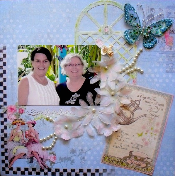
Hi and welcome. The first of October and a new challenge at Pixels and Paper where the inspiration photo could well have you thinking of your favourite cuppa , flowers or pastel colours. Pop on over to:-http://pixelsandpaperchallengeblog.blogspot.com.au/ and have a look at the image as well as what the team has come up with.
I've left my background paper as it came. This was a fabulous collection from Fabscraps and the images and colours were perfect for this challenge. I've added some punched paper 'lace' strips, using pale blue and pale green, a great sentiment card which has also doubled as a journalling tag, diecut trellis (Fabscraps again), diecut flowers from vellum, pearls and a store-bought butterfly.
All edges were smooshed with one of my new purchases from "Time To Create Handmade Treasures"... the gorgeous MementoLuxe inks. I used Angel Pink and Pear Tart. (green) .. both gorgeous, fresh colours. The vellum was sprayed lightly with Perfect Pearls and finished with a touch of the the MementoLuxe as well.
The photo is of a good friend and self having a quick interlude at 'http://timetocreate-handmadetreasure.blogspot.com.au/.
I hope you feel inspired to have a go at our challenge this month.
Cheers, for now.
Di
Designed for Pixels and Paper Challenges
Challenges Entered:
Lasting memories Scrapbook Layout Challenges Friends) at:
http://kcclayoutchallenges.blogspot.ca/2014/10/lm-211-beautiful-friendship.html
Subscribe to:
Posts (Atom)